互動圖像變化:純CSS
這是基本的數位互動寫作技法之一。
圖像的變化,常用的互動技能是image hover。
透過滑鼠指向後的圖像移動,所產生的圖像「資訊差」,來達到圖像空間敘事性意義的開展。
使用圖像來傳達意義,是數位文本的特色。圖像的意義要能在數位媒介中表現的更為豐富,使用互動來使圖像說故事,就是重要的新寫作思考特色。
使用圖像來傳達意義,是數位文本的特色。圖像的意義要能在數位媒介中表現的更為豐富,使用互動來使圖像說故事,就是重要的新寫作思考特色。
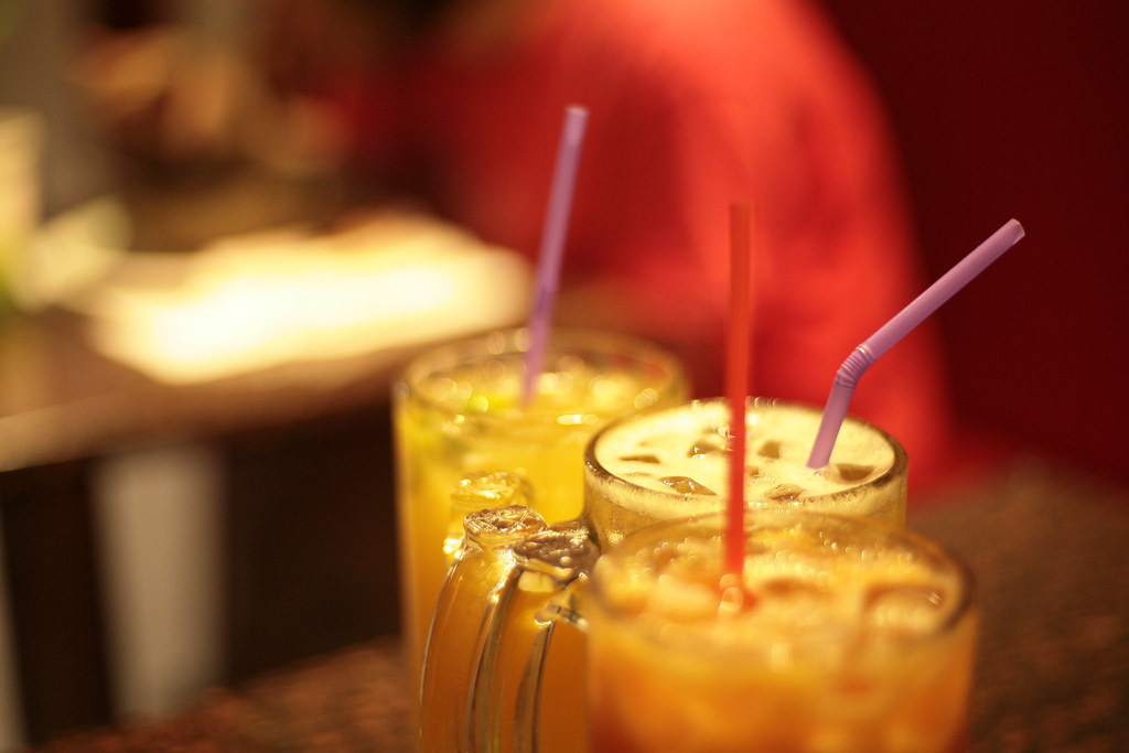
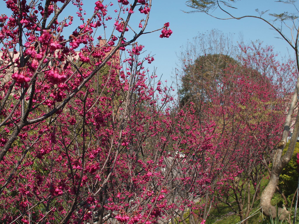
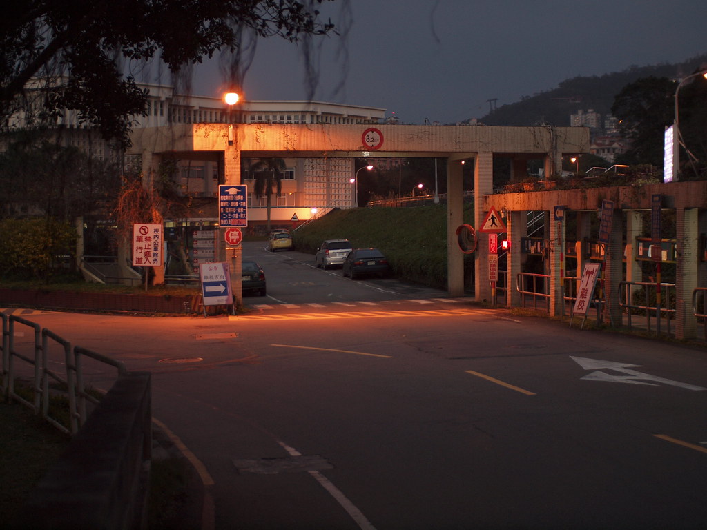
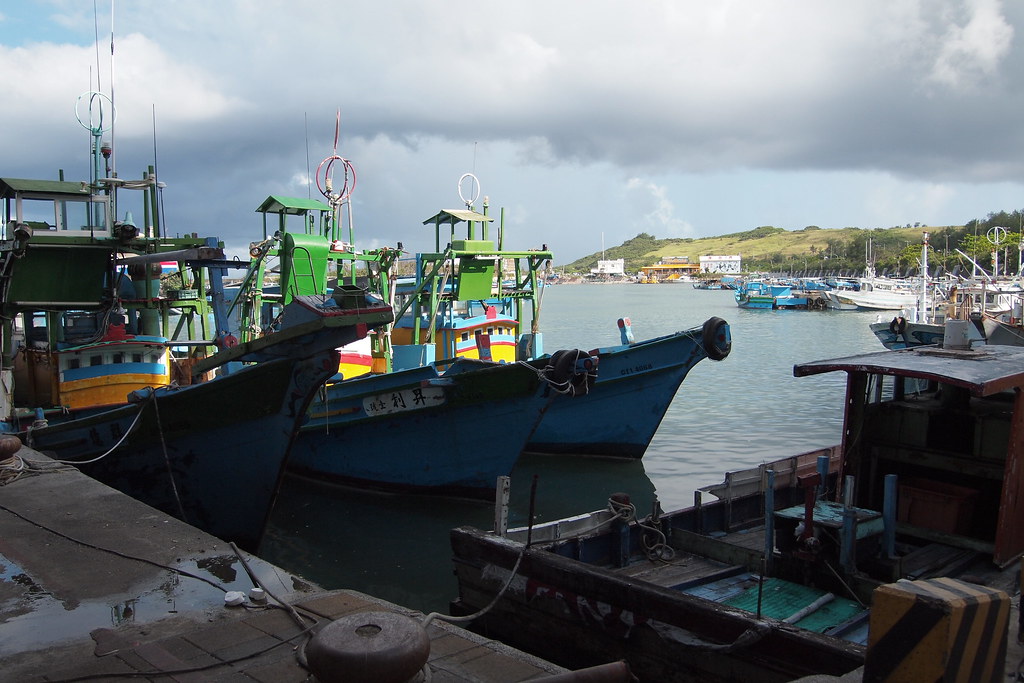
上圖:由左向右移
中圖左:由小變大 中圖右:由大變小 下圖:由下向上移 |
image hover 圖像的變化,互動之後若要能產生更豐富的敘事意義,那麼圖像前後的變化之間,就一定要有可以被連結思考的相關性畫面。如此讀者才能從圖像的變化中,解讀出 意義的呈現。 |
 |
 |
影音教學:
寫作5步驟:
- 設定div的長、寬度。
- 設定div的css功能為「超出隱藏」,overflow: hidden;
- 插入圖像。
- 設定圖像的hover CSS,二單位一組(如下,請注意教學影音說明)。
- 清除圖像原先設定的長寬度。
CSS語法:
<style>
/* 跨出div隱藏*/
.divofhid {
overflow: hidden;
}
/* 變大*/
.divgrowimg {
width: 310px;
height: 233px;
-webkit-transition: all 1s ease;
-moz-transition: all 1s ease;
-o-transition: all 1s ease;
-ms-transition: all 1s ease;
transition: all 1s ease;
}
.divgrowimg:hover {
width: 620px;
height: 425px;
}
/* 變小*/
.divpicsmall {
width: 620px;
height: 425px;
-webkit-transition: all 1s ease;
-moz-transition: all 1s ease;
-o-transition: all 1s ease;
-ms-transition: all 1s ease;
transition: all 1s ease;
}
.divpicsmall:hover {
width: 310px;
height: 233px;
}
/* 左右*/
.divpicmovlr {
width: 700px;
height: 467px;
-webkit-transition: all 1s ease;
-moz-transition: all 1s ease;
-o-transition: all 1s ease;
-ms-transition: all 1s ease;
transition: all 1s ease;
}
.divpicmovlr:hover {
margin-left: -300px;
}
/* 上下*/
.divpicmovbt {
width: 560px;
height: 374px;
-webkit-transition: all 1s ease;
-moz-transition: all 1s ease;
-o-transition: all 1s ease;
-ms-transition: all 1s ease;
transition: all 1s ease;
}
.divpicmovbt:hover {
margin-top: -170px;
}
</style>
語法來源:https://designshack.net/?p=36895
更多圖像的動態效果,請查閱&搜尋 CSS transitions 。