影像的翻轉
透過影像翻轉這樣的互動模態,影像可以傳達更多意義。這種意義遠遠超過單一以及靜止的影像
呈現。
有想法的使用文本互動呈現,可以表達出傳統文本所無法帶出的意義呈現模式。這是網路互動文本為我們帶來的新挑戰,寫作上的新挑戰。
有想法的使用文本互動呈現,可以表達出傳統文本所無法帶出的意義呈現模式。這是網路互動文本為我們帶來的新挑戰,寫作上的新挑戰。
範例一:圖像與圖像的翻轉
HTML碼:
<div id="f1_container">
<div id="f1_card" class="shadow">
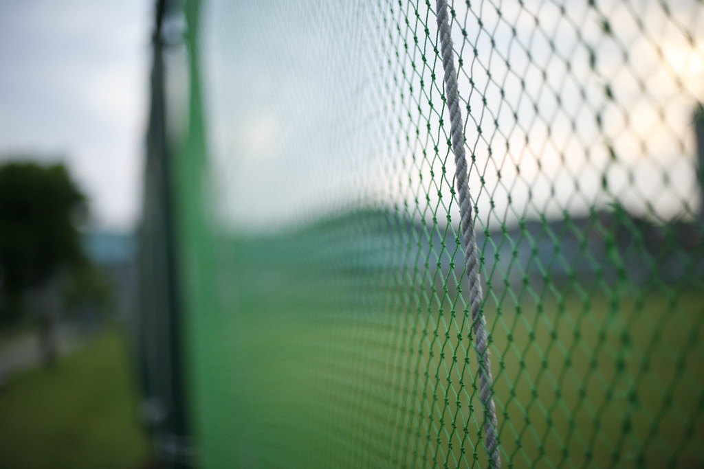
<div class="front face"> <img id="f1-pic01"
src="https://c8.staticflickr.com/9/8279/29282627391_634e02b687_b.jpg"></div>
<div class="back face center">
<img id="f1-pic02"
src="https://c3.staticflickr.com/8/7772/29147492562_2cc870640d_b.jpg"></div>
</div>
</div>
範例二:圖像與文字的翻轉
標題
內文內文內文內文內文內文內文內文內文內文內文內文內文內文內文內文內文內文內文內文
HTML碼:
<div id="f2_container">
<div id="f2_card" class="shadow">
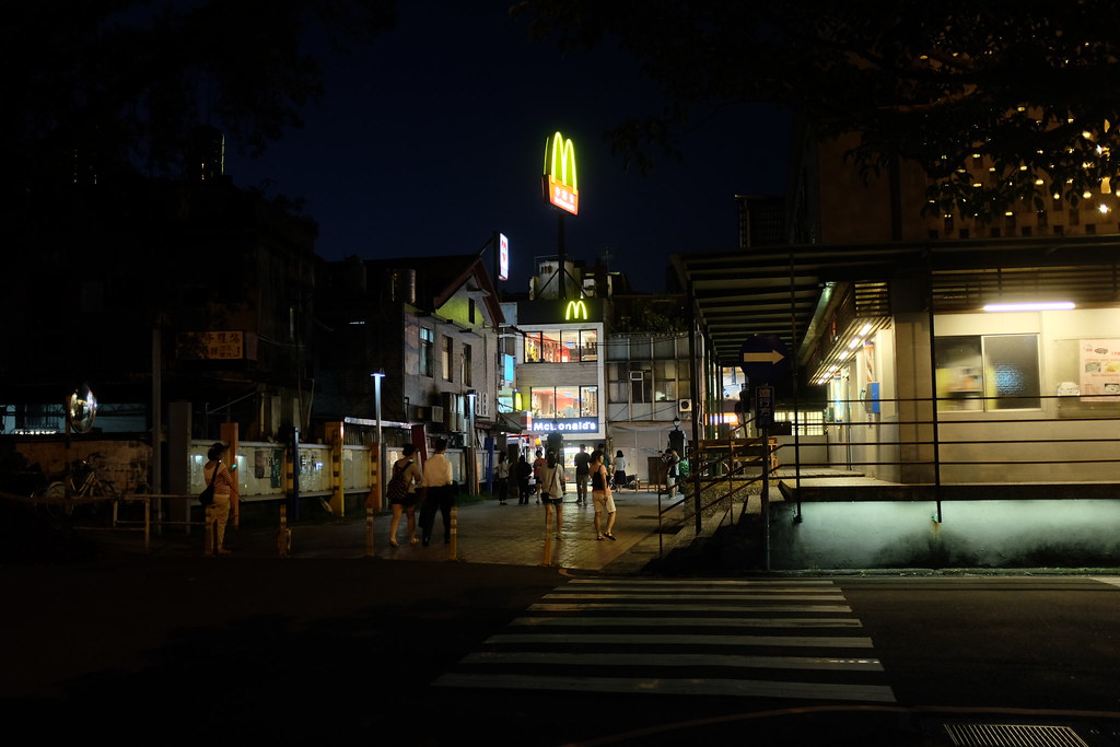
<div class="front face"> <img id="f2-pic01"
src="https://c7.staticflickr.com/9/8024/28901542670_ff22134ba2_b.jpg"></div>
<div class="back face center">
<p>標題</p>
<p>內文內文內文內文內文內文內文內文內文內文內文內文內文內文內文內文內文內文內文內文</p>
</div>
</div>
</div>
範例所用的 CSS:
<style>
#f1_container
{
position: relative;
width: 450px;
height: 300px;
z-index: 1;
}
img#f1-pic01 {
width: 450pxp;
height: 300px;
}
img#f1-pic02 {
width: 450pxp;
height: 300px;
}
#f1_container {
perspective: 1000;
}
#f1_container:hover #f1_card {
transform: rotateY(180deg);
}
#f1_card {
width: 100%;
height: 100%;
transform-style: preserve-3d;
transition: all 0.6s linear;
}
#f2_container
{
position: relative;
width: 450px;
height: 300px;
z-index: 1;
}
img#f2-pic01 {
width: 450pxp;
height: 300px;
}
img#f2-pic02 {
width: 450pxp;
height: 300px;
}
#f2_container {
perspective: 1000;
}
#f2_container:hover #f2_card {
transform: rotateY(180deg);
}
#f2_card {
width: 100%;
height: 100%;
transform-style: preserve-3d;
transition: all 0.6s linear;
}
.face {
position: absolute;
width: 100%;
height: 100%;
backface-visibility: hidden;
}
.face.back.center {
display: block;
transform: rotateY(180deg);
color: white;
background-color: #ADADAD;
}
.face.back.center >p:nth-of-type(1) {
width: 80%;
font-family: Verdana, '微軟正黑體';
font-size: 1.65em;
font-weight: bold;
line-height: 1.8;
letter-spacing: 0.07em;
margin-top: 2em;
margin-bottom: 0.5em;
margin-left: 40px;
border-bottom: 1px solid white;
}
.face.back.center >p:nth-of-type(2){
width: 80%;
font-family: Verdana, '微軟正黑體';
font-size: 1.23em;
font-weight: normal;
line-height: 1.2;
letter-spacing: 0.1em;
margin-left: 40px;
}
</style>
影音教學: